Analysis with the ergo
Racer®
|

|
Description of one session
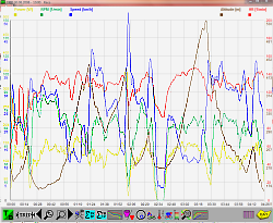
You see a graphical description of a session.
You can select the graphs individually.
Using the function buttons you can do
more data analysis.
|

|
Compare Trips
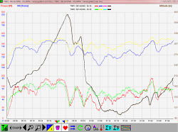
Compare two sessions on one graph.
We suggest that you either compare data from two sessions that took place on the same route or a session that two athletes did together.
You can select the graphs individually.
Using the function buttons you can do more data analysis like you can do in the graphical description of one session.
|

|
Summary
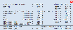
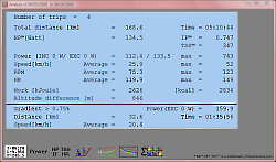
Analysing total trip.
Show an analysis of the complete trip in table form.
All values underneath the horizontal bar refer only to distance at an inclination
larger than the given value (e. g. in the example, it is more than 0,75 percent)
|

|
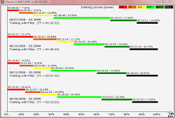
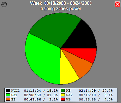
Statistic of training zones
All selected trips will be analysed by training zones.
|

|
Numerical summary
It shows a numerical summary of selected trips (min. 2).
Using the function buttons you can do
more data analysis.
|

|
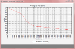
Average of max Power
The power will be analysed with respect to time (Average of max power).
Very high power-values will be reached only for a very short time.
That you also can see these, the scale gradations is logarithmical.
|

|
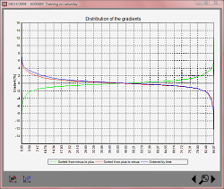
Distribution of the gradients
You see the distribution of the gradients sorted.
Using the function buttons you can do
more data analysis.
|

|
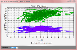
Power/RPM/Speed
Graphic, shown as a scatter plot of Power/RPM and Power/Speed.
|

|
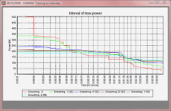
Interval of max power
Shows the duration a particular power (watt) was held for (Peakpower).
|

|
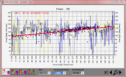
Power-HR
Analyzing the Relationship of Power and Heart Rate.
Yellow: power
Blue: average of the power
Red-Green graph: heart rate (hr)
Red: increasing hr
Green: decreasing hr
Points: relation between average of the power and the increasing heart rate
The scale for the power value of the points is the x-axis
Red line: linear regression of the points
More
|

|
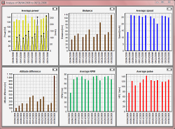
6er Chart
Shows a graphical analysis for maximum/ average values of the selected trips. Which parameter that is shown can be defined Tools.
In the first chart you can also see the time.
|

|
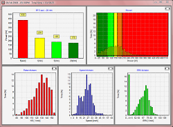
5er Chart
Shows the statistics of days and weeks (summary):
- Peak Power diagram
- Distribution of power against time
- Distribution of heart rate against time
- Distribution of speed against time
- Distribution of RPM against time
You can see how long one value of an appointed parameter can be held against time.
This gives a very good idea of the abilities of the athlete.
|

|
Pie chart
Analyse your workout zones.
|
|
|
Close
|

